Dashboard Design Pattern: Progressive Disclosure and Drill-Down
How to build operational dashboards that answer questions at every level
Most operational dashboards fail the same way: they show everything to everyone, all at once.
An executive wants to know if the fleet is healthy. A field technician wants to know which specific component is failing. A financial analyst wants to know if revenue targets are on track. Same data, completely different questions.
The typical solution is filters. Add dropdowns. Let users slice the data however they want. This sounds flexible but creates a different problem: users spend more time configuring the view than understanding the data.
The better solution is progressive disclosure: design each level to answer one question well, then make it obvious how to go deeper.
We built a dashboard for battery energy storage systems (BESS) that demonstrates this pattern. BESS sites are large-scale battery installations that store electricity from the grid or renewable sources and discharge it when needed. They're increasingly common as the grid adds more solar and wind. A single operator might manage dozens of sites, each containing hundreds of individual battery cells.
The dashboard goes from portfolio overview to individual battery cell in 4 clicks. The same pattern applies to any domain with physical hierarchy: manufacturing plants, logistics networks, data centers, retail locations.
The physical hierarchy defines the information hierarchy
Portfolio (all sites)
    └── Site (one location)
            └── Rack (one battery rack)
                    └── Cell (individual battery cell)
Each level answers a different question:
| Level | Question | Who asks it |
|---|---|---|
| Portfolio | "How's my fleet doing?" | Asset manager, executive |
| Site | "What's happening at this location?" | Site manager, operations team |
| Rack | "Which rack needs attention?" | Field technician |
| Cell | "What's wrong with this specific cell?" | Engineer, diagnostics |
Let's walk through each level.
Level 1: The executive view
The question: "How's my fleet doing?"
The answer: A single screen showing all sites, their status, and any items needing attention.
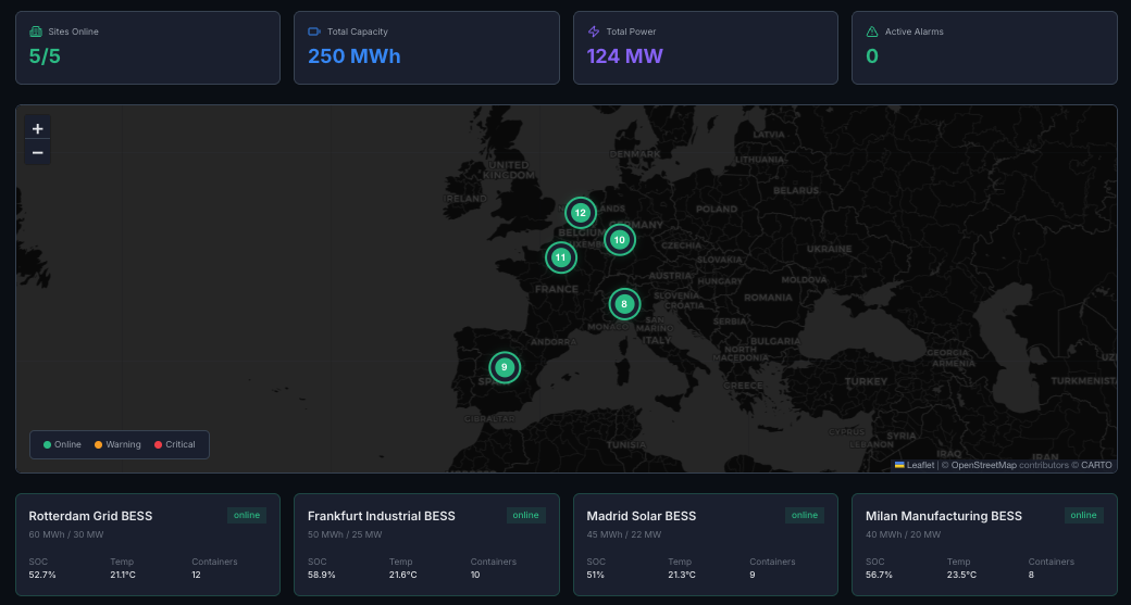
What's shown:
- • All sites at a glance
- • Status: online, degraded, offline, maintenance
- • Key metrics: availability, state of health (SoH), revenue vs. target
- • Alerts: count of open issues per site
What's NOT shown:
- • Individual rack data
- • Detailed power flows
- • Historical trends
Design principle:
If everything is green, you should be able to close this tab. If something is yellow or red, you should know which site to click into.
The click: Select a site → go to Level 2
Level 2: The operator view
The question: "What's happening at this location?"
The answer: Real-time operational view of a single site.
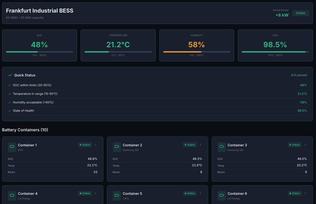
What's shown:
- • Live power flow (generation → battery → load → grid)
- • Current state: state of charge (SoC), temperature, power output
- • Today's performance: energy throughput, revenue, availability
- • Active alerts and recent events
- • Rack overview: which racks are healthy, which need attention
What's NOT shown:
- • Cell-level data
- • Long-term degradation trends
- • Financial projections
Design principle:
An operator should be able to assess site health in 10 seconds. "Is it running? Is it making money? Is anything broken?"
The click: Select a rack (or click an alert) → go to Level 3
Level 3: The technician view
The question: "Which rack needs attention?"
The answer: Detailed view of a single battery rack within a site.
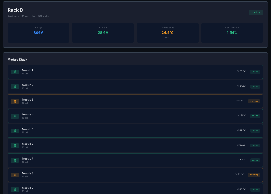
What's shown:
- • Module-by-module status
- • Temperature distribution across the rack
- • Voltage balance (are cells drifting apart?)
- • Cycle count and SoH for this rack
- • Maintenance history
What's NOT shown:
- • Other racks (unless comparing)
- • Portfolio-level metrics
- • Financial data
Design principle:
A technician standing in front of this rack should be able to confirm what they're seeing matches the dashboard, and know exactly which module to inspect.
The click: Select a module or cell → go to Level 4
Level 4: The engineer view
The question: "What's wrong with this specific cell?"
The answer: Diagnostic deep-dive into individual cell behavior.
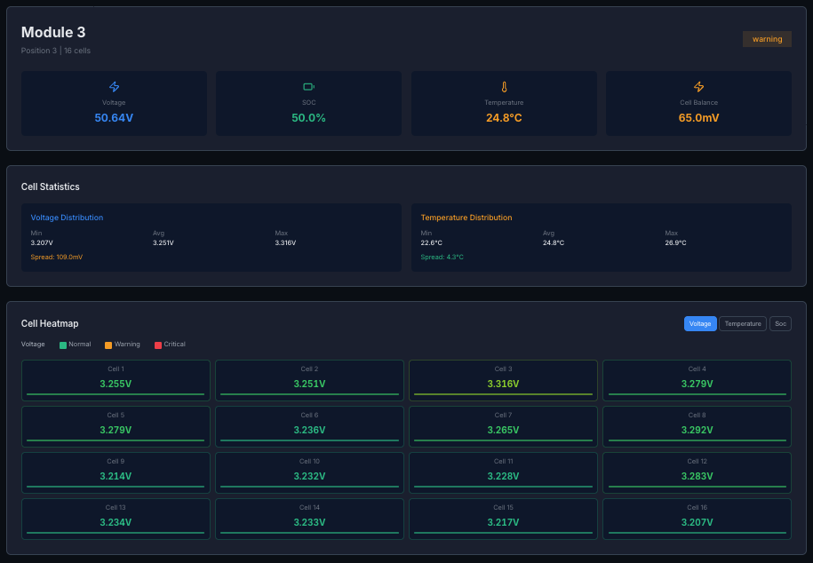
What's shown:
- • Voltage curve over time
- • Temperature history
- • Comparison to adjacent cells (is this one an outlier?)
- • Anomaly detection flags
- • Predicted remaining life
What's NOT shown:
- • Anything about other sites
- • Financial metrics
- • High-level summaries
Design principle:
This is for diagnostics. An engineer investigating a problem should have everything they need to determine: is this cell failing? Should it be replaced? Is it affecting its neighbors?
The design principles behind the pattern
1. Answer the question at each level
Every screen has ONE primary question it answers. If you can't state that question clearly, the screen is trying to do too much.
2. Invite deeper exploration
Every screen should make it obvious how to go deeper. Clicking a site goes to site view. Clicking a rack goes to rack view. No dead ends.
3. Maintain context
When you're at Level 4, you should always know: which rack, which site, which portfolio. Breadcrumbs, headers, or persistent navigation. The user should never feel lost.
4. Optimize for the common case
Most of the time, everything is fine. The portfolio view should reward that: "All green, move on with your day."
The deeper levels are for exceptions. They should be rich and detailed, because if you're there, you're investigating a problem.
5. Time horizons match the level
| Level | Default time view |
|---|---|
| Portfolio | Today / This week |
| Site | Last 24 hours |
| Rack | Last 7 days |
| Cell | Last 30 days (to see degradation) |
Higher levels = shorter time horizons (operational). Lower levels = longer time horizons (diagnostic).
Why navigation beats filtering
Most dashboards are flat. They show everything at once and expect users to filter their way to relevance.
That's backwards.
Users don't want to filter. They want to navigate.
A good dashboard is like a building:
- •Lobby (portfolio): orientation, wayfinding
- •Floor (site): the space you're working in
- •Room (rack): the specific area of focus
- •Desk (cell): the detailed work surface
You don't show someone the entire building blueprint when they just need to find their desk.
What we'd do differently
More user testing at each level. We designed based on conversations with operators, but we should have watched them use the actual dashboard sooner. Some transitions that felt obvious to us weren't obvious to users. The click target for drilling down needed to be more prominent.
Search from day one. Progressive disclosure works great for exploring, but sometimes users know exactly what they want. "Show me Rack D at the Frankfurt site" should be a single action, not four clicks. We added search later, but it should have been there from the start.
Mobile-first for field technicians. We designed for desktop first because that's where executives and operators work. But technicians are often on-site with tablets or phones. The rack and cell views needed more work to be useful on smaller screens.
Try it yourself
This hierarchy is implemented in the Miru operations dashboard. Four clicks from portfolio to cell.
miru-explore.vercel.app → Data Insights
Building dashboards for energy assets, manufacturing, or logistics? This pattern applies anywhere you have a physical hierarchy.
The takeaways
1. Design for questions, not data.
Each screen answers one question well.
2. Progressive disclosure > information overload.
Show less, link deeper.
3. Match time horizons to user intent.
Operators think in hours. Engineers think in weeks.
4. Navigation > filtering.
Let users click into context, not filter down to it.
5. Optimize for green.
Most of the time, everything is fine. Reward that.