From Knowledge Graph to AI Tutor: Building MathPractice.ai
Most "adaptive" learning platforms aren't adaptive at all. They speed up or slow down a linear path. They don't understand why a student is struggling.
Every math curriculum is organized the same way: Chapter 1, Chapter 2, Chapter 3. A straight line from start to finish. Learn this, then learn that, then learn the next thing.
But that's not how math actually works.
Math is a web of interconnected concepts. Fractions depend on division. Algebra depends on arithmetic. Geometry depends on algebra, but also on spatial reasoning that you developed years earlier. Trigonometry pulls from geometry, algebra, and the coordinate plane simultaneously.
When a student struggles with quadratic equations, the problem might not be quadratics at all. It might be that they never fully grasped factoring. Or negative numbers. Or the distributive property from three years ago. The linear curriculum can't see this. It just moves forward.
Why students get stuck (and teachers can't see why)
Teachers know this intuitively. When a student is stuck, experienced teachers probe backward: "Do you understand what a variable represents? Can you solve simpler equations first?" They're mentally traversing the dependency graph, looking for the broken link.
But this diagnostic process happens invisibly. There's no map. No visualization of where the gaps are. Teachers rely on experience and intuition, which means less experienced teachers (and students studying on their own) are navigating blind.
Adaptive learning platforms try to help, but most follow the same linear model. They might slow down or speed up, but they still treat math as a sequence. If you're struggling with Topic 47, they give you more practice on Topic 47. They don't ask whether the real problem is back in Topic 23.
The insight: make the structure visible
We kept thinking about this problem. What would it look like to actually visualize mathematical knowledge as a network? Not a hierarchy, but a true graph, where concepts connect to their prerequisites and to the concepts they enable.
And what if you could overlay a student's proficiency onto that graph? See at a glance where they're strong, where they're weak, and (critically) which weaknesses might be causing downstream problems.
So we built it.
What we built
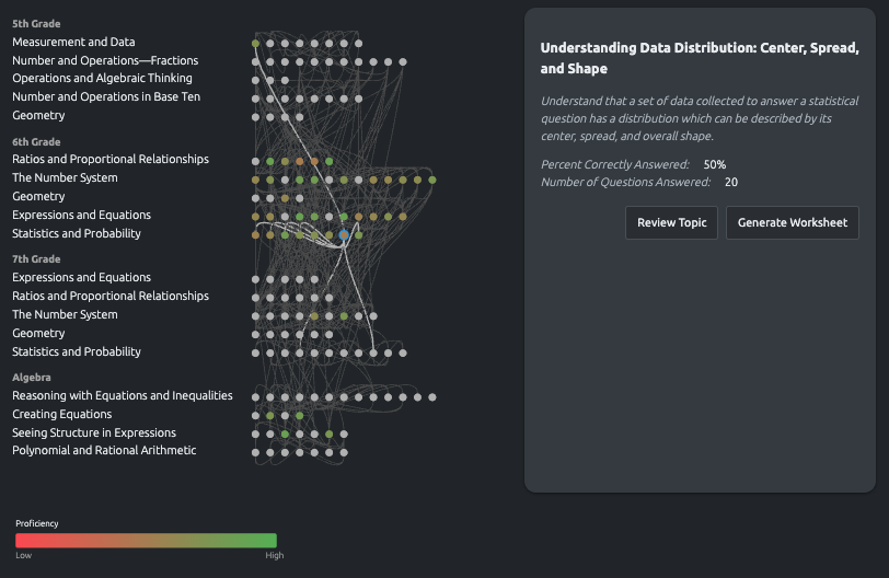
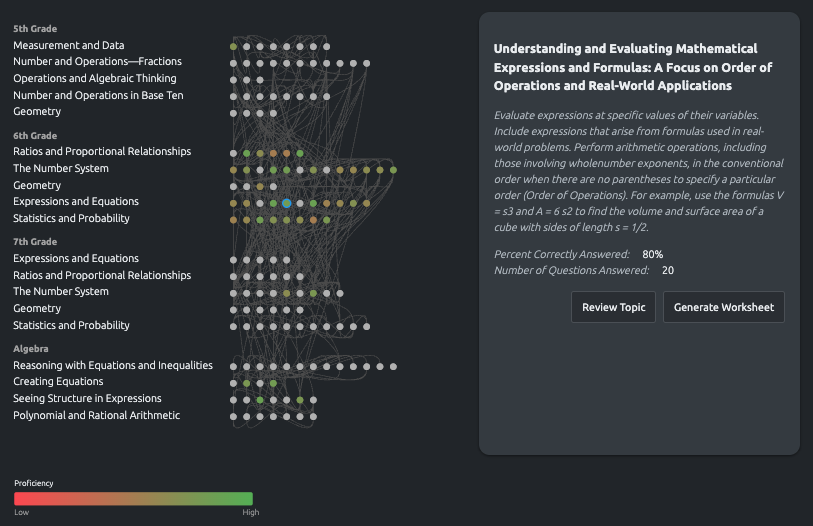
MathPractice.ai is a system for visualizing and navigating educational concept relationships. The core interface is a knowledge graph: every mathematical concept from 6th grade through high school geometry, mapped with its dependencies.
Concepts appear as nodes. Edges connect prerequisites to the concepts that depend on them. The edges have weights: some dependencies are strong (you can't do algebra without arithmetic), others are weaker (geometry helps with trigonometry, but you could manage without deep geometry knowledge).
The interesting part is the proficiency overlay. As a student practices, their performance data colors each node: green for mastery, yellow for partial understanding, red for gaps. Suddenly you can see the whole picture. Not just "this student is struggling with trigonometry," but "this student has gaps in ratios and proportional relationships that are affecting everything downstream."
How the system surfaces gaps
The knowledge graph
The left side shows hierarchical categories aligned to Common Core standards: 5th Grade, 6th Grade, 7th Grade, Algebra. Within each, the specific domains: Ratios and Proportional Relationships, The Number System, Expressions and Equations. This gives familiar structure for navigation.
The central display shows concept nodes arranged horizontally within their domains, connected by edges that represent dependencies. Hover over any node and the relevant edges highlight, showing you exactly what this concept depends on and what depends on it.
The proficiency heat map
Each node is color-coded based on the student's demonstrated proficiency. Red means low performance, green means mastery, with a gradient between. This isn't a single test score. It's accumulated data from practice sessions, weighted by recency.
Click any node to see details: the specific concept description, percent correctly answered, number of questions attempted. From there you can generate targeted practice worksheets or review materials.
The timeline
A timeline component lets you scrub through history. See what the student's knowledge state looked like three months ago versus today. Watch gaps fill in over time, or identify concepts that seemed mastered but have degraded without practice.
What changes when you can see the map
For teachers, this is diagnostic power they've never had. Instead of guessing why a student is struggling, they can see the dependency chain. Instead of assigning generic review, they can target the specific upstream gap that's causing problems.
For students studying independently, it's a map of their own knowledge. They can see exactly where they need work, and understand why certain topics feel hard (often because prerequisites aren't solid).
For parents, it's visibility into what's actually happening. Not just "my kid got a C in math," but "my kid is strong in geometry but has gaps in algebraic expressions that are holding back their equation-solving."
The system doesn't just track progress. It makes the structure of mathematical knowledge visible. That visibility changes how you learn.
What we'd do differently
Start with fewer concepts. We mapped the entire K-12 math curriculum. In retrospect, a tighter focus on middle school algebra would have let us go deeper on the dependency relationships. Breadth is easy. Depth is where the value is.
More teacher input on the graph structure. We built the initial dependency map from curriculum standards and our own understanding. Teachers who use the system often suggest edges we missed, or question edges we included. The graph should have been collaborative from the start.
Earlier focus on the "so what." A beautiful visualization means nothing if it doesn't change behavior. We spent time on the graph rendering before we had clear answers for "what should a teacher do with this information?" The action layer matters more than the visualization layer.
The real lesson
Math curricula are organized as lines because books have pages. But math itself is a graph: a network of concepts with complex interdependencies. When you can see the graph, and overlay a student's understanding onto it, you can finally answer the question that matters: not "what topic should we cover next," but "what's actually holding this student back?"
Simple is hard. The real work wasn't building the visualization. It was deciding what to show and what to hide so that teachers and students could act on what they see.
MathPractice.ai is in research preview. You can explore the concept visualization and try the adaptive practice system at mathpractice.ai.